Let’s Look at Android 16 QPR1 and All This Material 3 Expressive Design
The release of Android 16 QPR1 is easily the star of today’s Google I/O show for those of us in the Android space. While Google showed off some neat Gemini and AI demos, and basically spent the entire keynote talking about AI, we’re still Android fans here. And with the Android 16 QPR1 update in … Continued Read the original post: Let’s Look at Android 16 QPR1 and All This Material 3 Expressive Design

The release of Android 16 QPR1 is easily the star of today’s Google I/O show for those of us in the Android space. While Google showed off some neat Gemini and AI demos, and basically spent the entire keynote talking about AI, we’re still Android fans here. And with the Android 16 QPR1 update in beta, we get our first on-device taste of Android’s new Material 3 Expressive design.
After loading it up during the keynote, we’ve had some time to dive in and have found so many big and small changes, all of which seem like noteworthy changes. I should point out that this all feels very early in the build, so there are some items missing that we should see as this approaches a stable release in September.
Ready for a first look at Android 16 QPR1 and Material 3 Expressive on a Pixel 9 Pro?
Lock screen, app switcher, app drawer, status bar changes
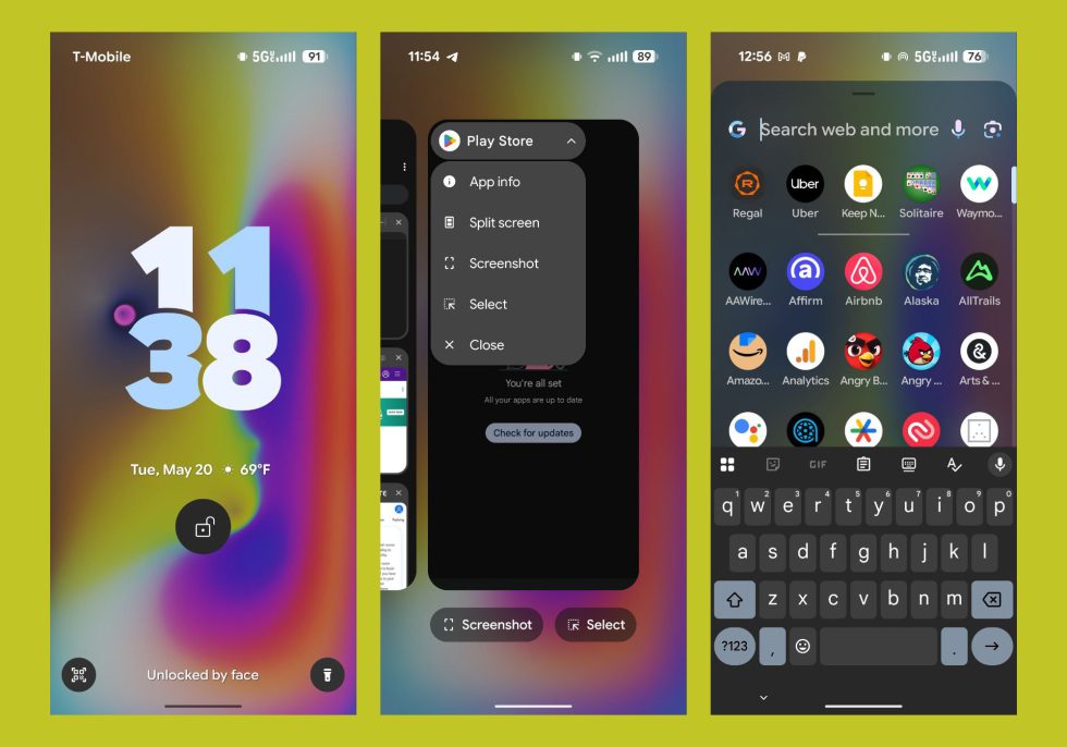
In this first look, the changes aren’t major, but you can see on the lock screen clock, we’ve moved the date and weather to underneath the clock. When that shrinks if you get notifications, that info then moves to the right side of the clock, rather than under it in the smaller clock version. Small change! But noteworthy.
Then, you can see in the app switcher a new dropdown menu with simple switch to drop apps into split-screen, plus the first taste of Material 3 Expressive’s blurring behind the top of the app drawer. You can see the blur in the app switcher too, I guess.
Sharp eyes should also notice that the status bar font has changed, with tweaked icons and a bolder font.
Lock screen clock customizer’s big changes
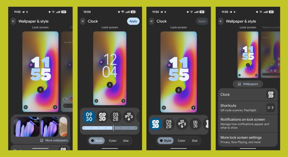
Google is doing some big changes to the lock screen and wallpaper editing pages, also known as the “Wallpaper & style” page. Above, you get a look at how you can zoom in or out of the clock page when choosing between options to give you a more full-screen experience, there are sliders on some clocks to adjust size or thickness of their font, and the other options have been redesigned some.
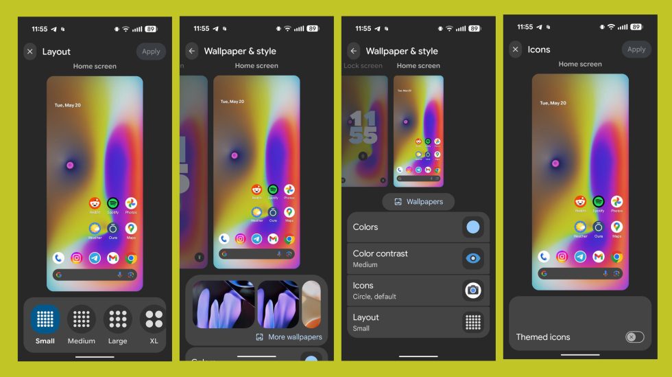
And below, we have the wallpaper editing page with a new “Small” layout that has added an icon/app row to my home pages. You’ll see the same zoom in-and-out effect too, plus there is a placeholder for icon shape changes. We’ve seen icon shape choices leak previously and Google teased them, but they aren’t showing here on my Pixel 9 Pro just yet. Unfortunately, Google still hasn’t found a way to fully theme all icons.
New wallpaper “Magic Portrait” options, including weather effects
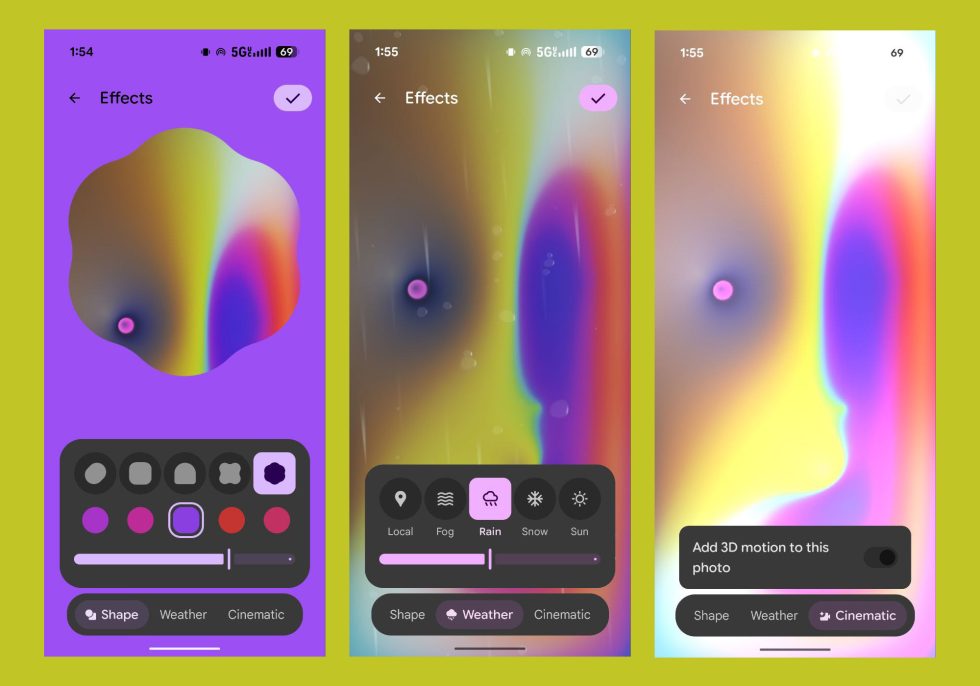
Google has added a new wallpaper editor or style in its “Effects” settings that it is referring to as “Magic Portrait.” When you get to choosing a wallpaper on the “Wallpapers & style” area, you can tap on your current wallpaper and then hit the “Effects” button. Google is now showing new “Shape” and “Weather” options. The Shape option lets you choose a shape to wrap a portion of your wallpaper in with different shapes, plus some color choices that the phone thinks match. In the Weather area, you can simply choose weather types to see those in action on your home and lock screens, sort of like live wallpapers.
Cool, I guess?
Notifications in compact or full list views

Google has added a new “Notifications on lock screen” setting that can be accessed from a couple of places. This new setting lets you choose from “Compact view” or “Full list” notifications, with the compact really only showing as dots you’ll need to expand or tap on. The full list view is your standard Android notification lock screen, with full-width notifications showing.
This certainly isn’t a new Android concept, as Samsung and OnePlus have had options like this for years, but this is another one of those areas where Google has decided to catch-up on its Pixel devices. We’ll take it, even if it’s late.
Look at this new Quick Settings area…

The new quick settings area has a lot going on, but the first thing you’ll notice is going to be that thick font. Google has really brought a dramatic change to the system font in places and you can’t get away from it. I think it’ll grow on me…I think. That font allows you to really identify each quick settings tile and what it should do, so there’s that at least.
On the left side, you can see a list of notifications, with some separations for messaging and non-messaging apps. There’s also a huge “Clear all” button in the center now. It is joined by shortcuts on each side for notification history and other notification settings. I really wish that right-side icon was just for the general system settings, but that still takes another swipe down.
When expanded, we have a new brightness slider for Material 3 Expressive and a new editing panel. The new editor lets you tap on icons and then expand or shrink them down. Some tiles can now just be a single button, like for Do Not Disturb or your hotspot. Some of the tiles now let you tap on their left sides as a button or in the bigger right-side area to access more info or settings for that tile (like in Modes, you can tap the left side to activate DND or tap “Modes” for more). I feel like this area has even more tricks up its sleeves that we’ll try to find.
Settings see slight changes
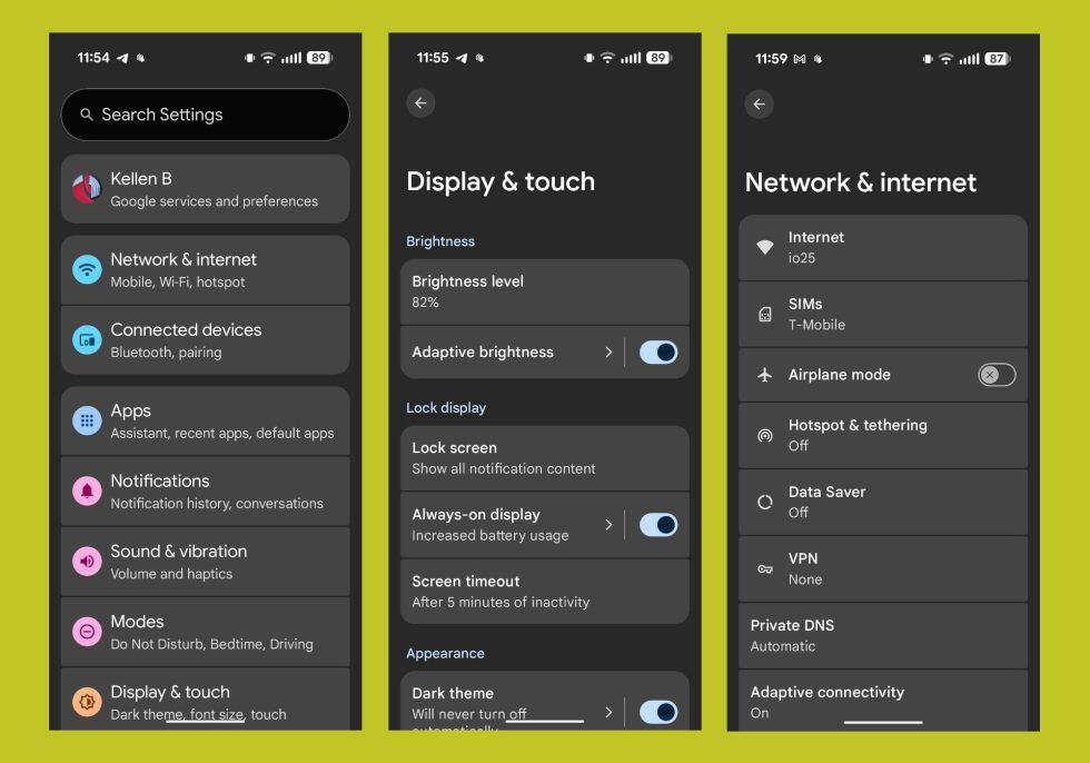
The settings area hasn’t changed much from the other Android 16 builds, but it is newish, especially for those coming from earlier Android 15 builds. We now have some colors back to each setting type, that bolder font as headers, and Google is showing you a full-screen settings list when you tap into an area now instead of dropping everything down to the bottom of the screen. This is a really great change from Samsung’s idea that everything should start low and let you work upwards.
App info pages updated

Again, Google is still working on all of this, but one settings area they revamped is the App Info page. We now just have all of the Material 3 Expressive concepts in a single page. It looks nice.
The new volume slider design
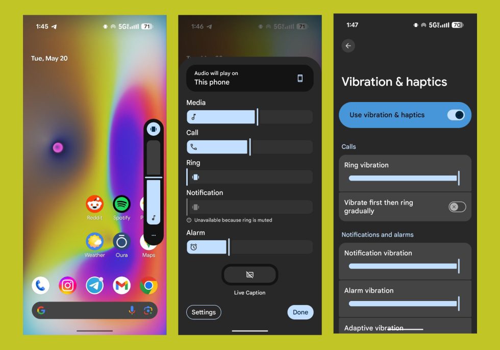
The volume slider has switched over to Material 3 Expressive, just like the brightness slider. That means a scrollable bar with a line through it that more precisely shows the position you’ve set. We can see this in the side-mounted volume bar as well as the bigger volume panel. Google is still working on the rest of the settings area, though, so the Volume area is showing the old design unless you dive into the haptics sections, where you can see new sliders again.
This is really just a visual change, that sort of like the font, is going to take some getting used to.
More coming!
Read the original post: Let’s Look at Android 16 QPR1 and All This Material 3 Expressive Design