One UI 8 might finally abandon Big Tech’s cheap design tricks
We already had an exclusive taste of One UI 8 through internal builds, and, to be honest, there's not much to say about this upcoming update based on these early test firmware versions. However, we can't judge One UI 8 this early, and there is a high probability that the upcoming update will have more […] The post One UI 8 might finally abandon Big Tech’s cheap design tricks appeared first on SamMobile.
We already had an exclusive taste of One UI 8 through internal builds, and, to be honest, there's not much to say about this upcoming update based on these early test firmware versions. However, we can't judge One UI 8 this early, and there is a high probability that the upcoming update will have more tricks up its sleeve once it's ready for prime time.
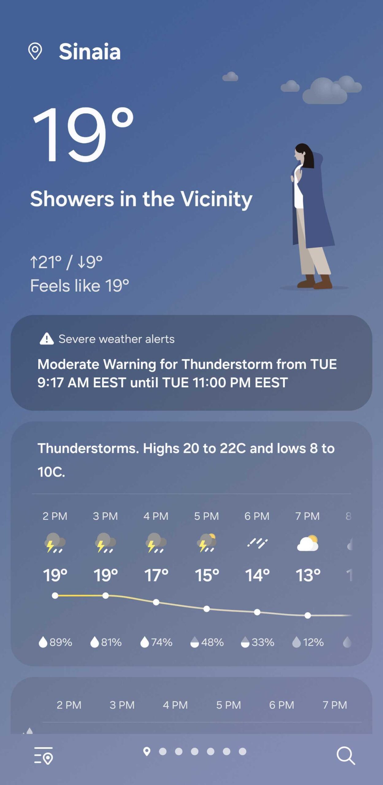
More to the point I'm trying to make here, we tried the Weather app in One UI 8, and it fills me with hope. Why? Because the One UI 8 app revamps animations in a way that might signal a major (I think) shift in Samsung's art style.
After years of overusing the Corporate Memphis art style in several areas of One UI, Samsung's upcoming One UI 8 update might finally put an end to using cheap Big Tech design tricks. At least, the One UI 8 Weather app appears to be doing so.
What is the Corporate Memphis art style? In short, it's a flat art style that took over the Big Tech industry more than a decade ago. It consists of illustrations that often feature expressionless and disproportionate human caricatures. These characters have unusually long and/or bendy limbs and small heads. Often, the art style feels amateurish, even though it is used by trained professionals. Here are a few examples of Corporate Memphis-style illustrations pulled from Samsung's One UI 7.
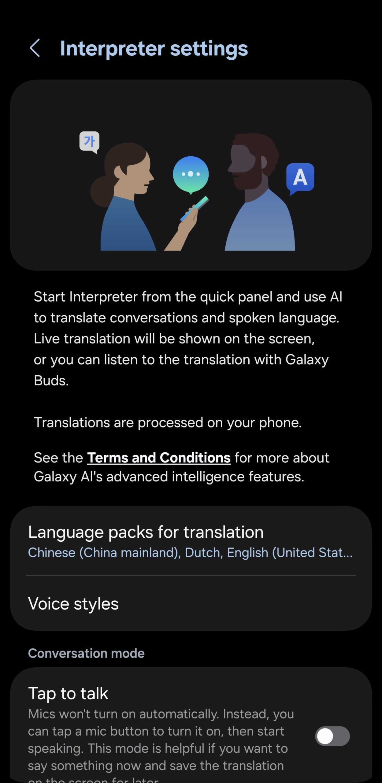
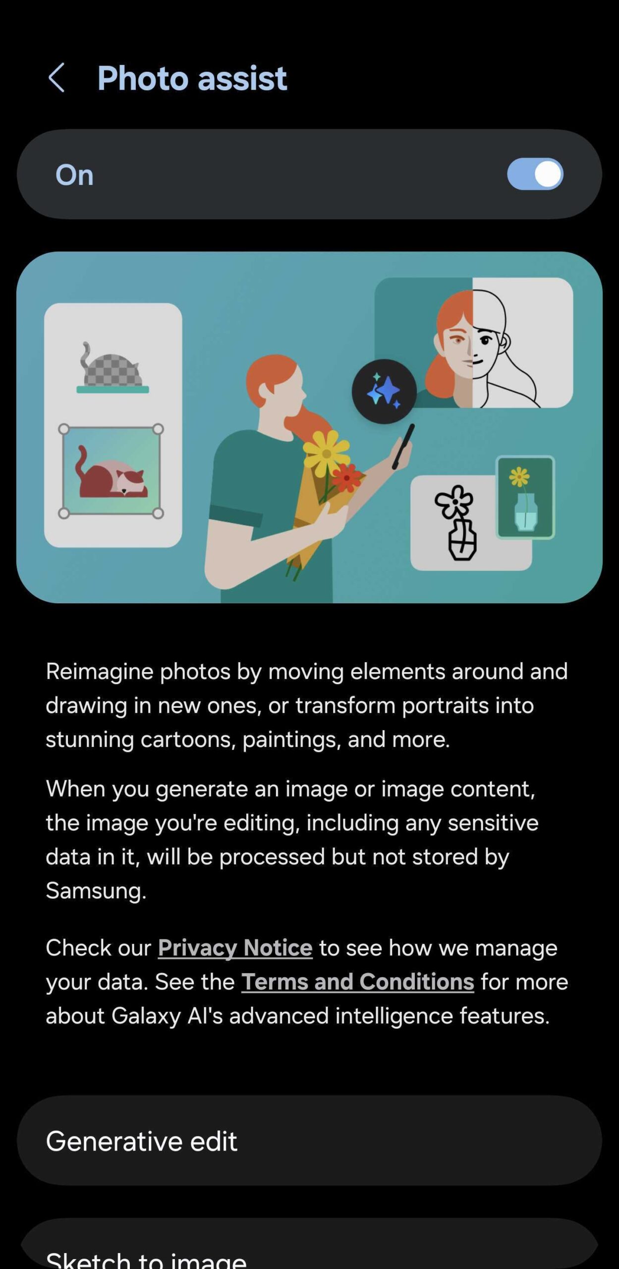
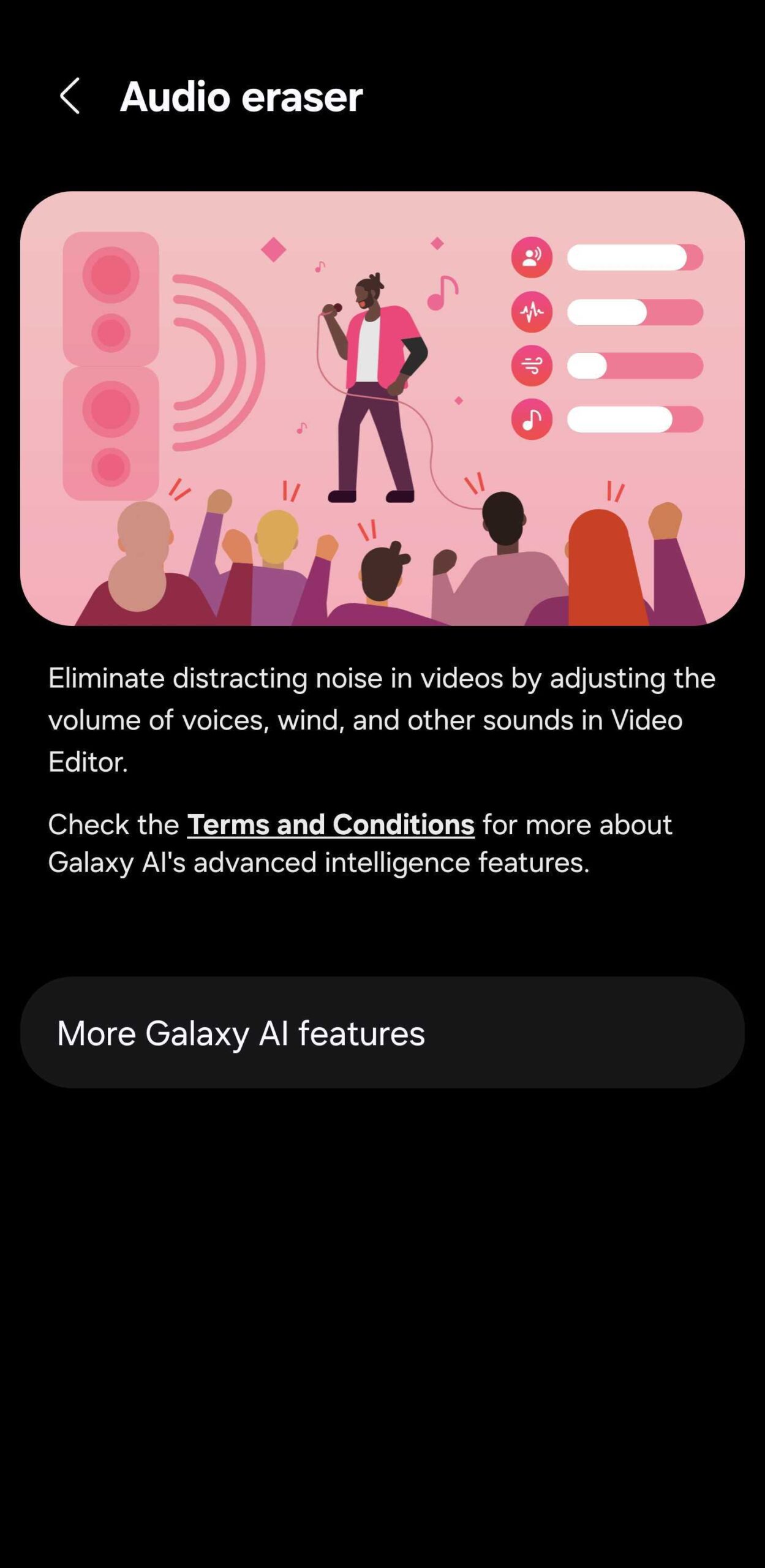
If you like this art style, I can't hold it against you. However, I don't, and it is well-known that this style of illustration has been polarizing from the start, with many artists and users criticizing it for being too generic, lazy, and overused by Big Tech because it is cheap and easy to produce.
Samsung has employed the Corporate Memphis art style in some of its One UI illustrations for years. Needless to say, I was never a fan, and if it hasn't already, the art style will never grow on me. Should One UI 8 depart from it, I'll call that a win. It's one of the reasons why I am now truly looking forward to Samsung's next big update.
Browse the latest Galaxy phone offers
Of course, anything can change by the time One UI 8 goes live, and maybe the Weather app is just a preview that may not even materialize. Or, even if those cool new animations will replace the Corporate Memphis illustrations inside the Weather app, there's no guarantee that the same will happen across all of One UI 8.
Still, I think it's a hopeful start. I like the alternative I saw in the early One UI 8 Weather app far better. Want to see for yourself? I'll leave you with the short video below, which demonstrates the new and colorful animations and art style in greater detail. Do you still prefer the Corporate Memphis approach over this potential alternative?
The post One UI 8 might finally abandon Big Tech’s cheap design tricks appeared first on SamMobile.

