Google unveils Android 16 with bold design, new features
After releasing four beta versions of Android 16, Google revealed its final look featuring a big redesign. This new version of Android has a bold new look based on the ‘Material 3 Expressive' UI design language. The company says it wants to add emotions to the UI to make everything engaging while also making it […] The post Google unveils Android 16 with bold design, new features appeared first on SamMobile.
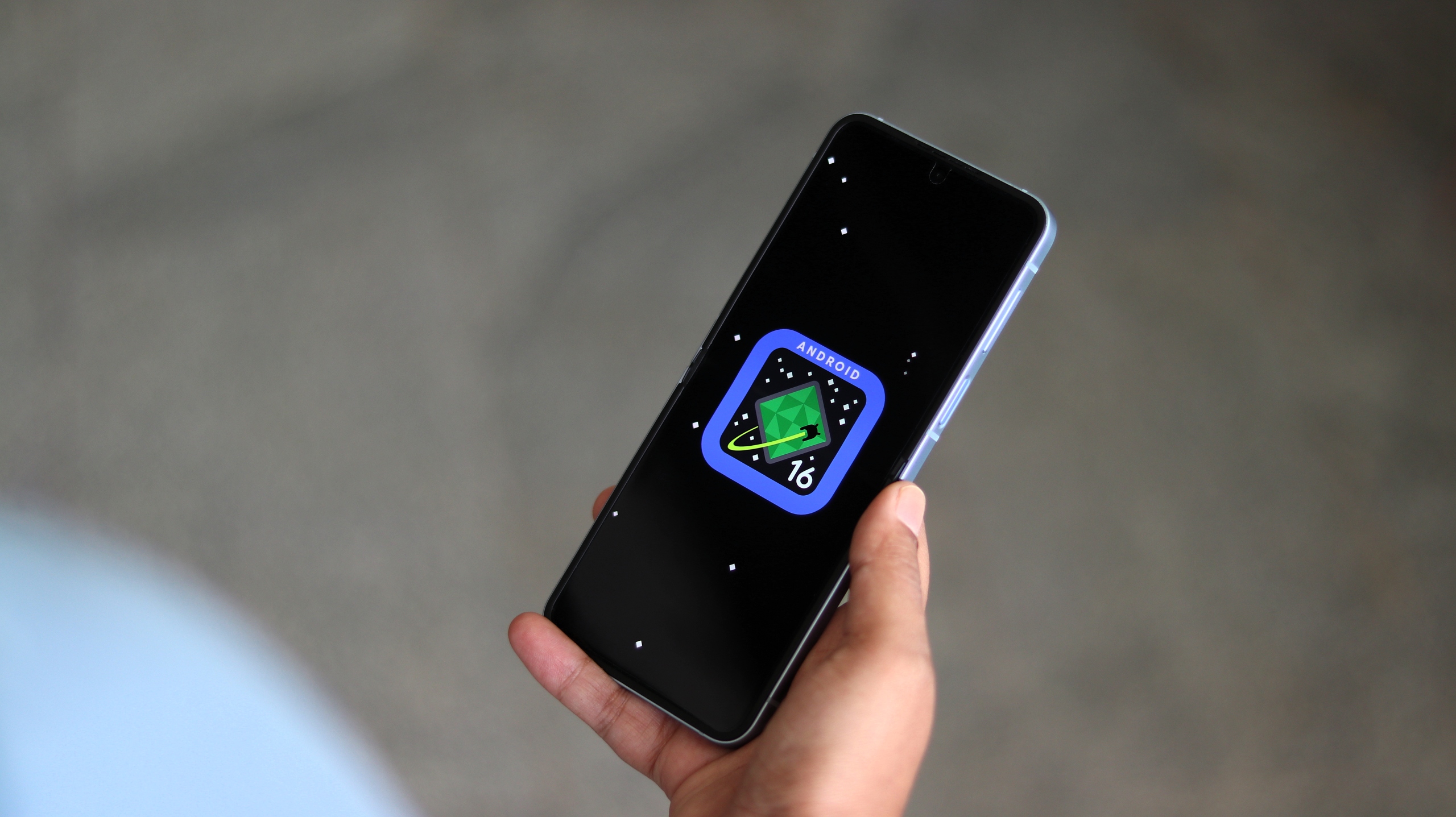
After releasing four beta versions of Android 16, Google revealed its final look featuring a big redesign. This new version of Android has a bold new look based on the ‘Material 3 Expressive' UI design language. The company says it wants to add emotions to the UI to make everything engaging while also making it easier to use.
Let us have an extensive look at the new design.
Android 16 uses Material 3 Expressive language for a bold new look
The Material 3 Expressive design won't be available with the first stable Android 16 release for Pixel devices. It will arrive on Pixel devices later this year. Some of that new look will end up appearing on Samsung phones and tablets running Android 16-based One UI 8 software, especially inside Google's first-party apps later this year.

New animations, more haptic feedback, impactful fonts, newer color themes
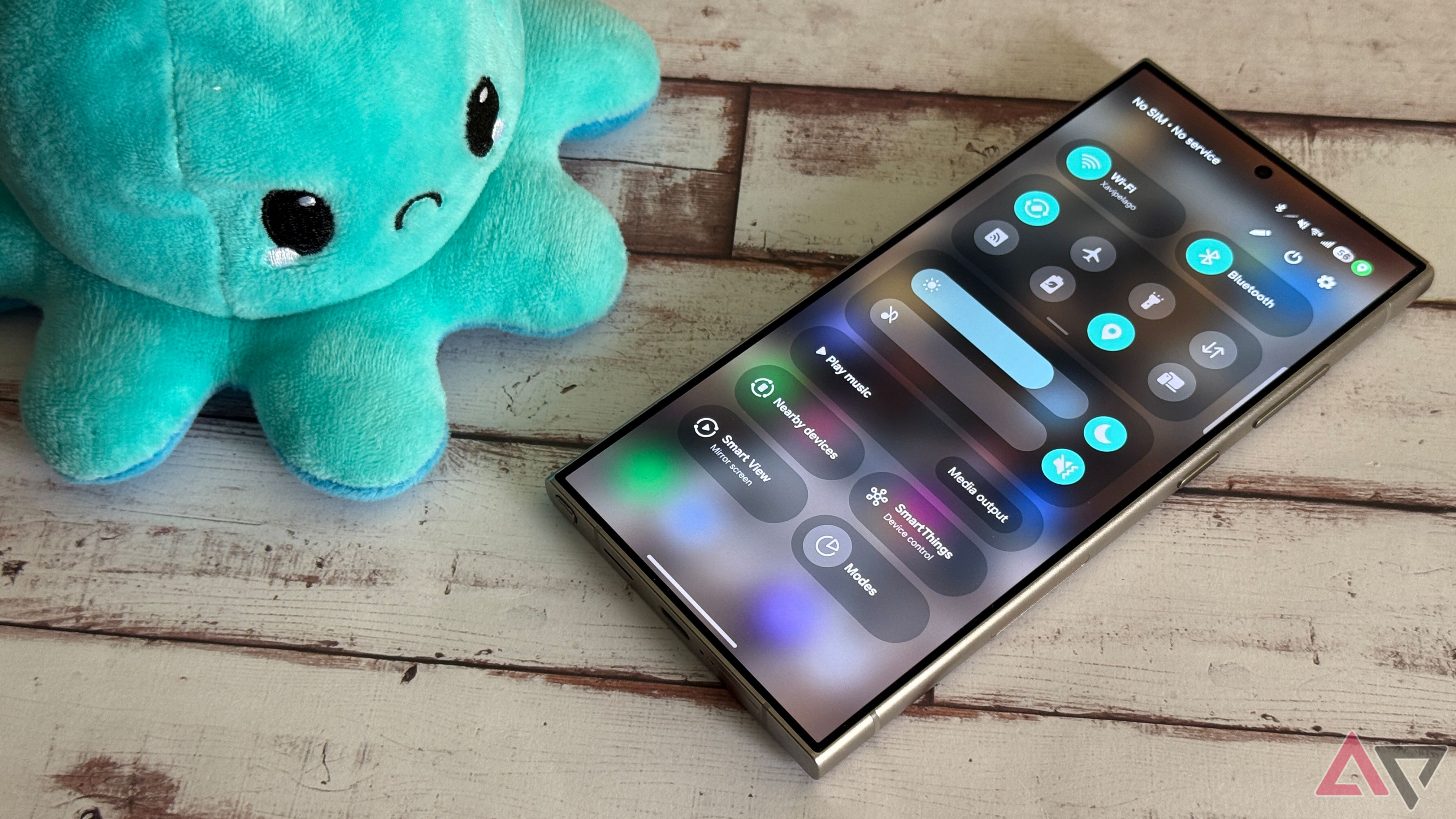
Google has made Android 16 more expressive than earlier through a combination of springy animations, fresh color themes, impactful fonts, improved motion physics, background blur effects, new icon shapes, and a more customizable Quick Settings panel. You can change the size of each Quick Setting toggle.
UI elements react more playfully to your touch through a combination of animations and haptic feedback. For example, when you dismiss a notification, you will feel a satisfying rumble, while other notifications in the list will subtly react to it. Such haptic feedback effects can be found throughout the UI, including when you access the Notifications screen, close an app from the Recent Apps screen, or adjust the volume.
Google says Material 3 Expressive has a clear separation between primary, secondary, and tertiary color tones in a theme, which makes to users which actions matter the most. Headlines and key actions now use bigger and more impactful fonts to attract the user's attention.
Background blur effect, more customizable Quick Settings
The background blur effect has been used in the Quick Settings panel and the Notifications area. You can also find more in-your-face typography and bigger buttons for primary actions in an app or across the UI. Google claims there won't be any negative effect of these changes on the battery life.
The Quick Settings panel has a blockier-looking screen brightness slider, while Quick Setting tiles shift from a pill shape to a rounded rectangle shape when they are activated.
Live Updates
Live Updates is another new feature that can display up-to-date information in notifications related to delivery, ridesharing, and navigation apps. It is visible on the lock screen and the Always-On Display (AOD) screen. You can also access it via a pill-shaped element on the status bar (top left part of the screen) or from the Notifications screen (first entry in the list).
The company claims that Android 16 and its Material 3 Expressive design language is the most rigorously researched design Android has ever seen. Google used 46 global studies, hundreds of design variations, and insights from over 18,000 participants to design this new look.
Check Galaxy S25 Deals
App developers can use the updated Material motion APIs to make their apps look and feel in line withthe Material 3 Expressive design language. Google has added more fonts and shapes to its library, so developers can use them to create more diverse app designs. UI elements can now turn from one shape to another in a more smooth manner for a more fluid experience.
The post Google unveils Android 16 with bold design, new features appeared first on SamMobile.