I thought I would love this One UI 7 feature but I don’t
For the most part, I enjoy everything Samsung's new massive update offers. One UI 7 feels more modern and polished than previous versions, but there is one feature I can't get along with. Prior to updating my phone to One UI 7, I thought I would love it, but as it turns out, it's the […] The post I thought I would love this One UI 7 feature but I don’t appeared first on SamMobile.
For the most part, I enjoy everything Samsung's new massive update offers. One UI 7 feels more modern and polished than previous versions, but there is one feature I can't get along with. Prior to updating my phone to One UI 7, I thought I would love it, but as it turns out, it's the one thing I don't like about Samsung's new update. Or, at the very least, I have mixed feelings about it.
I'm referring to the new “separate” option for the notification and quick panels. More accurately, I don't see any benefit to the new gesture set One UI 7 is forcing on us if we want to use the new notification panel design.
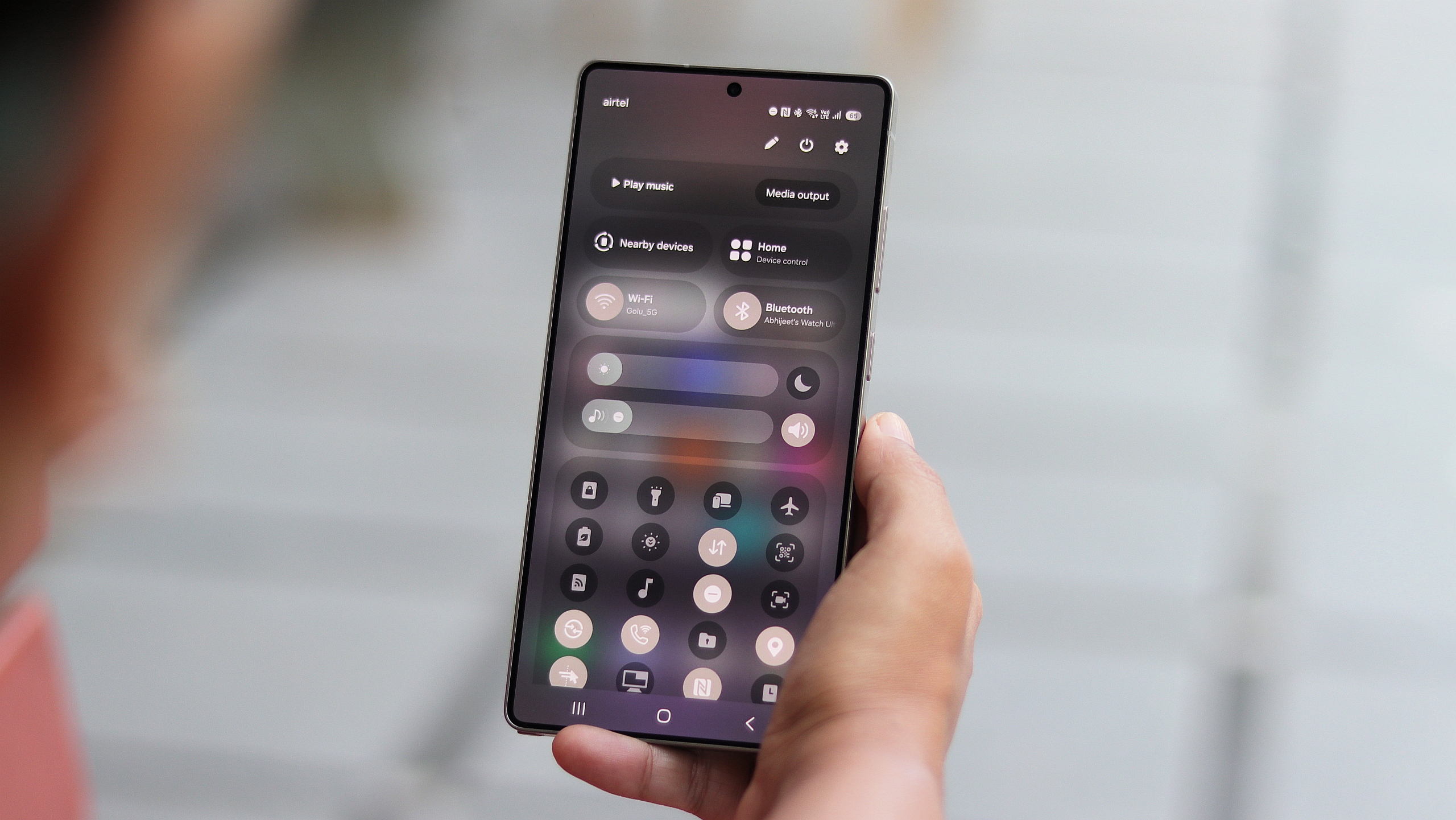
If you're unfamiliar with One UI 7, here is precisely what I mean. The update gives users two design and control options for the notification and quick panels.
- Together: This option emulates the One UI 6.1.1 notification panel design and gesture set. The notification panel contains quick toggles and additional controls. You swipe down once for the notification panel and twice for the quick panel.
- Separate: This is the default setting in One UI 7. It offers a cleaner notification panel without quick toggles, device controls, and media output buttons. The separate panel design requires you to swipe down once for the notification panel and then swipe left for the quick panel.
I'm a big fan of clean and concise UIs, and I can appreciate that the “separate” notification panel serves only one function in One UI 7: delivering notifications.
There's nothing wrong with having the functionality of the two panels more well-defined. I prefer it this way. Visually, I find the notification and quick panels in One UI 7 better organized.
However, I'm also a fan of intuitive controls, and I can't get along with the new gesture set associated with the “separate” setting. I find it inferior to the old method, but regardless of how I feel about it, I just can't understand why we can't have the best of both worlds and choose our panel designs and gesture sets separately.
Check out Samsung's latest deals and gift ideas
This is how I hope One UI 8 addresses the issue
I gave the separate panel design in One UI 7 a fair shot for over two weeks, but I'm giving up. For the sake of the old and arguably superior gesture set, I have now switched back to the “together” panel design.
But I must admit I miss the cleaner notification panel and wish I wouldn't have to make this bizarre compromise.
And yes, in One UI 7, you can swipe down from the rightmost area of the status bar to access the quick panel directly. However, that area is not well defined, and besides, this new gesture doesn't feel any better or more intuitive than the one it replaces: swiping the status bar down using two fingers from anywhere on the status bar.
I won't hold it against Samsung if the company wants to experiment with new gestures. I'm all for that. Nevertheless, this doesn't do it for me, and I wish One UI 7 would have included a third option to allow users to combine the new panel design from the “separate” option with the tried and tested gesture set from the “together” option.
That would have been the ideal setup for me, and I can only hope that the upcoming One UI 8 update will give me this option. It is now the biggest item on my One UI 8 wishlist.
The post I thought I would love this One UI 7 feature but I don’t appeared first on SamMobile.